Portfolio
Creative work across different disciplines
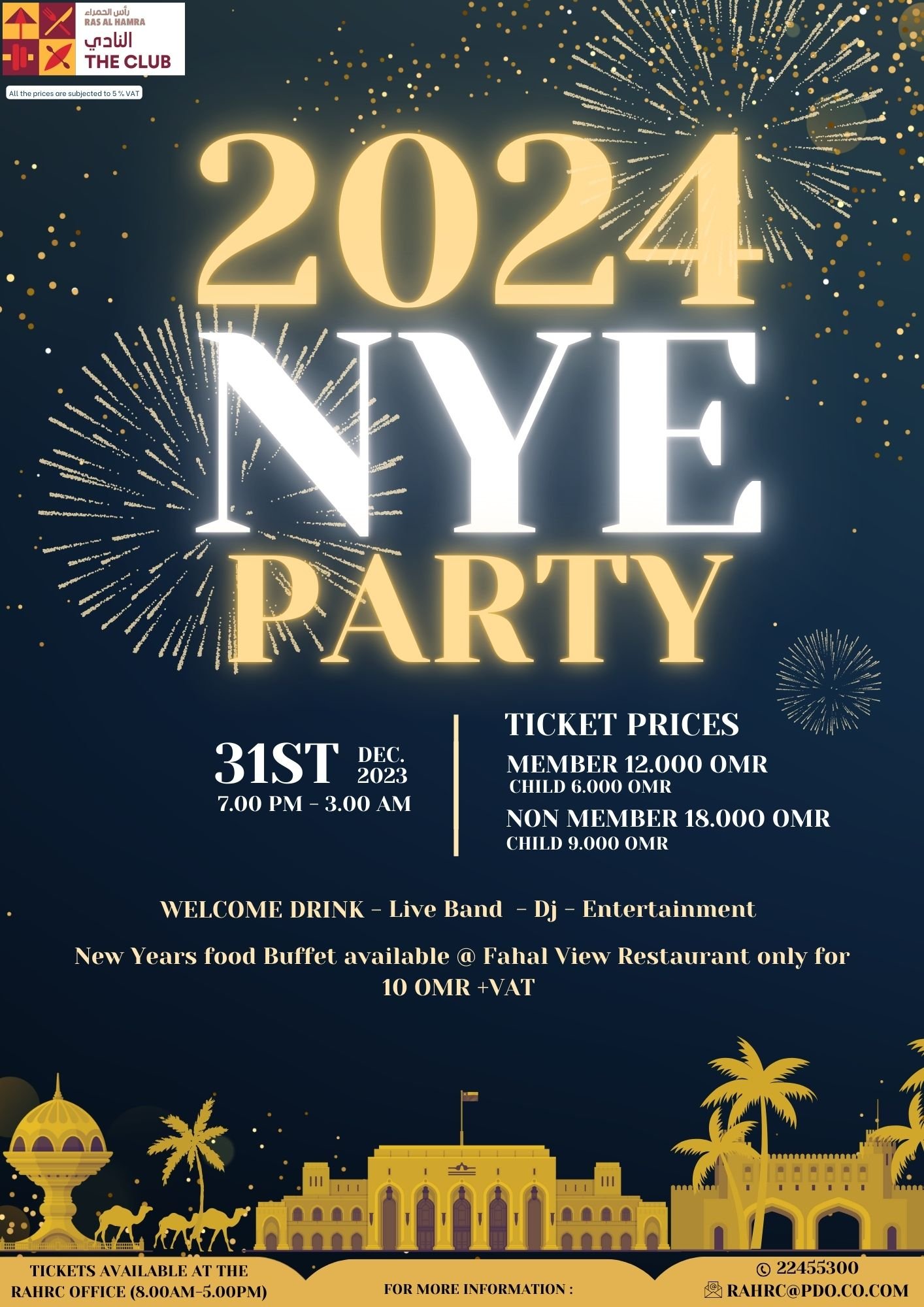
New Year’s Eve 2023 Celebration – RHRC Oman
Designed the official event poster and matching entry tickets for RHRC’s biggest celebration of the year. The design features Muscat’s iconic landmarks, bold typography, and festive fireworks to capture the spirit of the city and the excitement of the night.
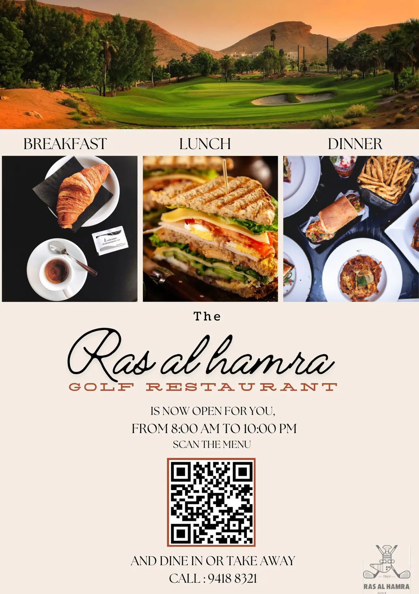
Ras al Hamra Golf Restaurant
Created the official poster for the Ras al Hamra Golf Restaurant, combining inviting food photography with a QR code for the new digital menu. The clean and modern layout highlighted breakfast, lunch, and dinner options, encouraging guests to return and explore the refreshed offering.
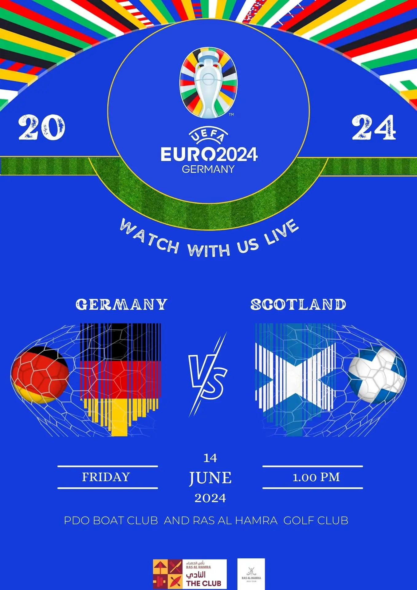
UEFA EURO 2024 – Germany vs. Scotland Match Poster
Designed a bold and dynamic poster for the UEFA EURO 2024 live screening event at PDO Boat Club & Ras al Hamra Golf Club. The design highlights the team colors and national flags integrated into a modern football-inspired layout to build excitement and attract attendees.
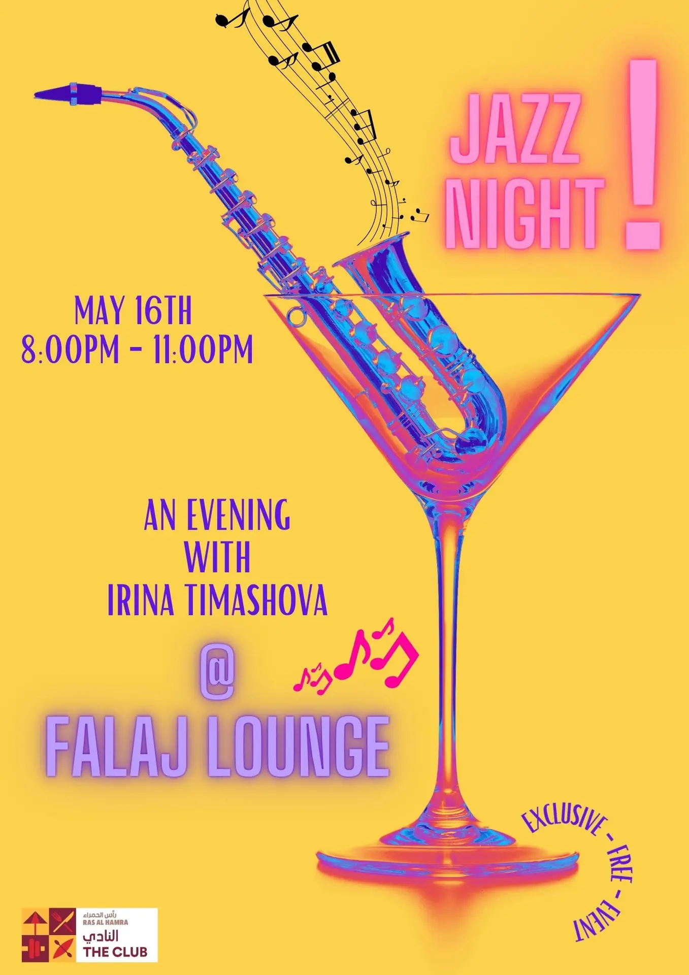
Jazz Night Poster – Falaj Lounge
Created a bold and colorful poster for a live jazz night featuring Irina Timashova. The design combines vibrant colors, musical elements, and a playful layout to set the mood for an elegant and lively evening.
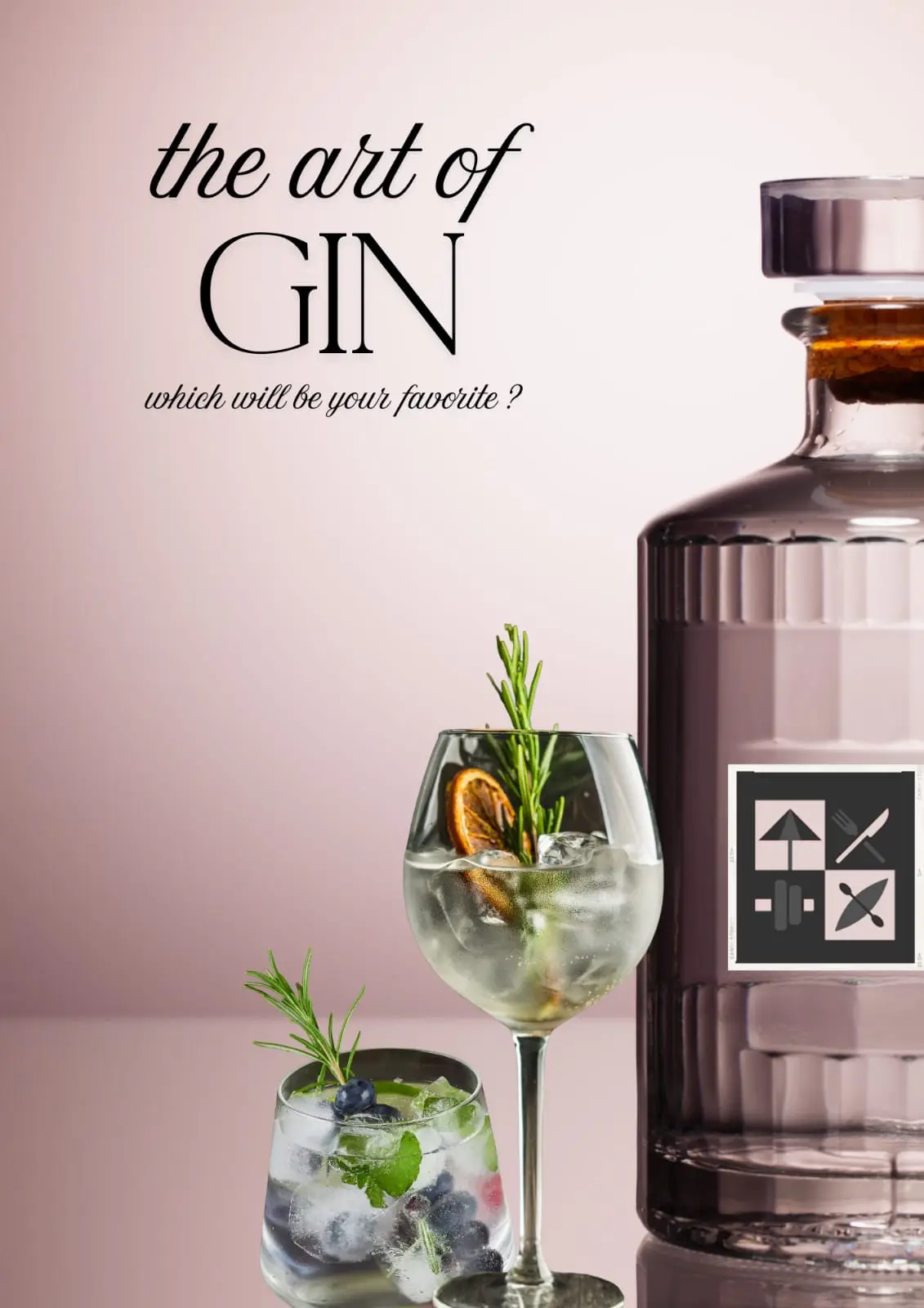
The Art of Gin – Falaj Lounge Special Night
Created the cocktail menu for the Art of Gin evening at Falaj Lounge. The design combines a minimalist layout with refined drink photography, and the club’s logo was subtly integrated to keep the branding consistent.
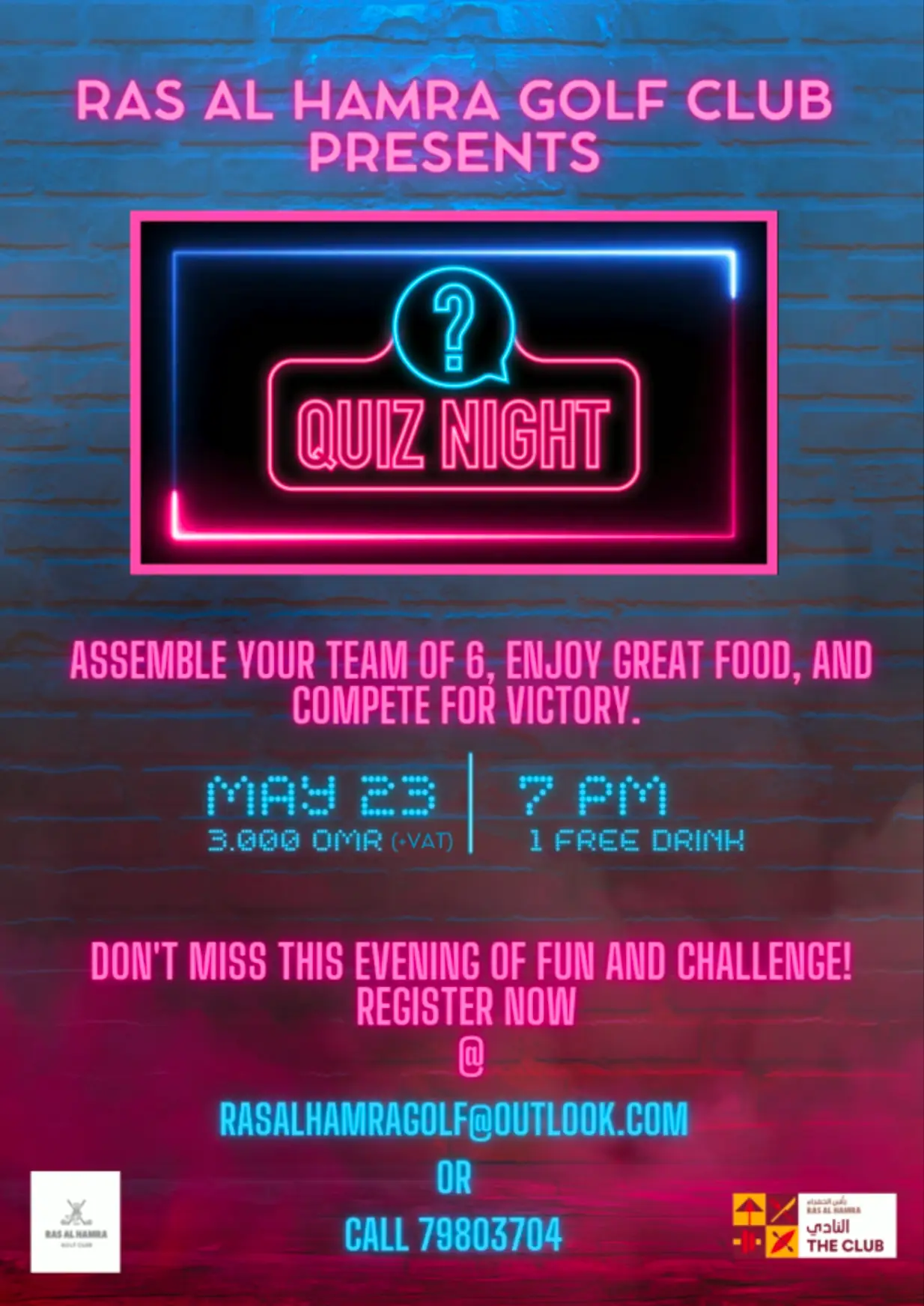
Quiz Night – Glow Animation Poster
Created an animated version of the Quiz Night poster with a glowing effect to grab attention and bring the design to life. This motion graphic was used on digital screens and social media to promote the event and build excitement.
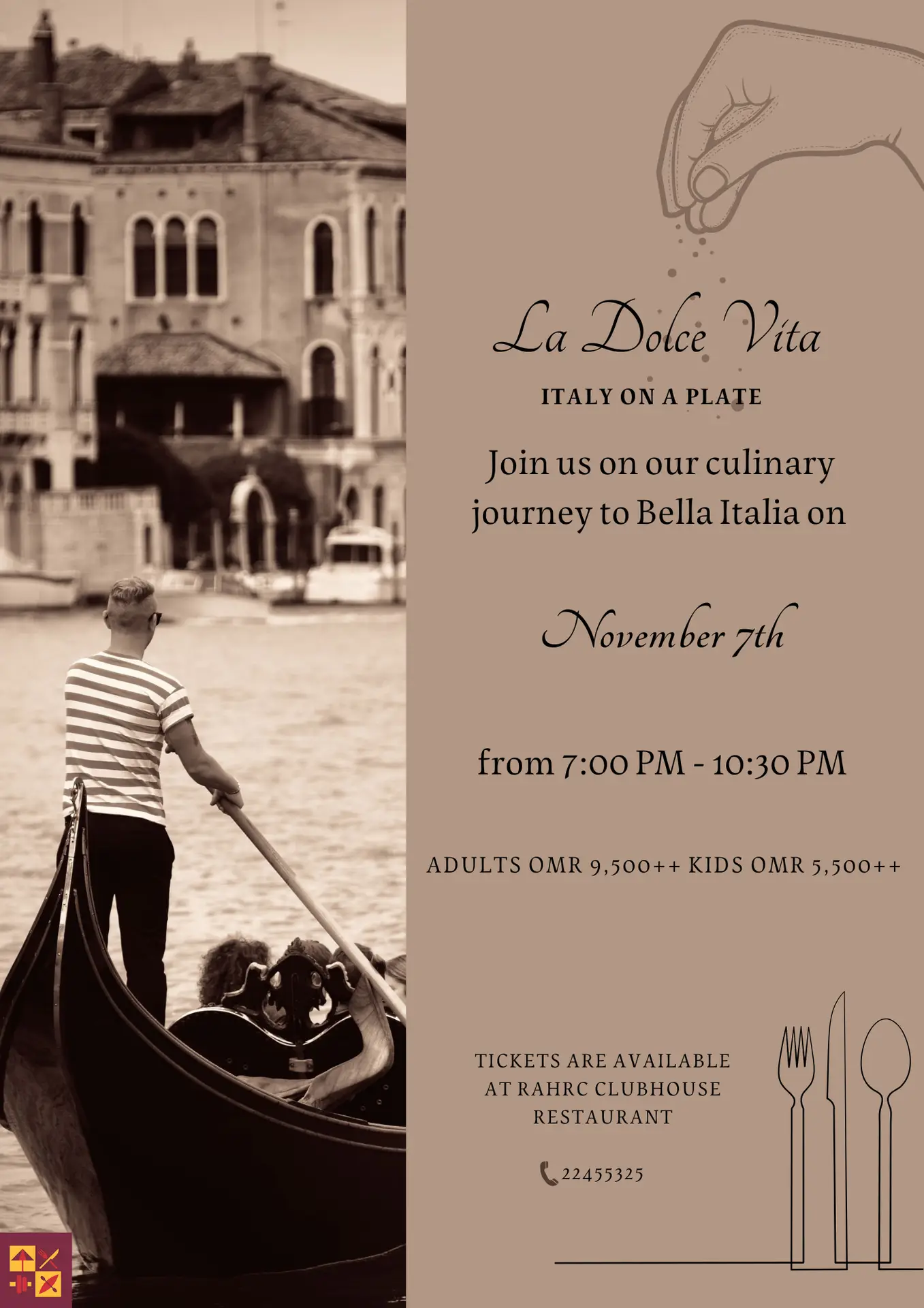
La Dolce Vita — Italy on a Plate
I channelled classic Italian cinema and trattoria charm into a typographic centerpiece: an elegant title lockup, tricolour-inspired accents, and generous breathing room guide the eye from theme to date to ticket details in one smooth sweep. Subtle contrast, tight spacing, and a calm grid keep it refined yet inviting, instantly signalling “Italy” before a word is read.
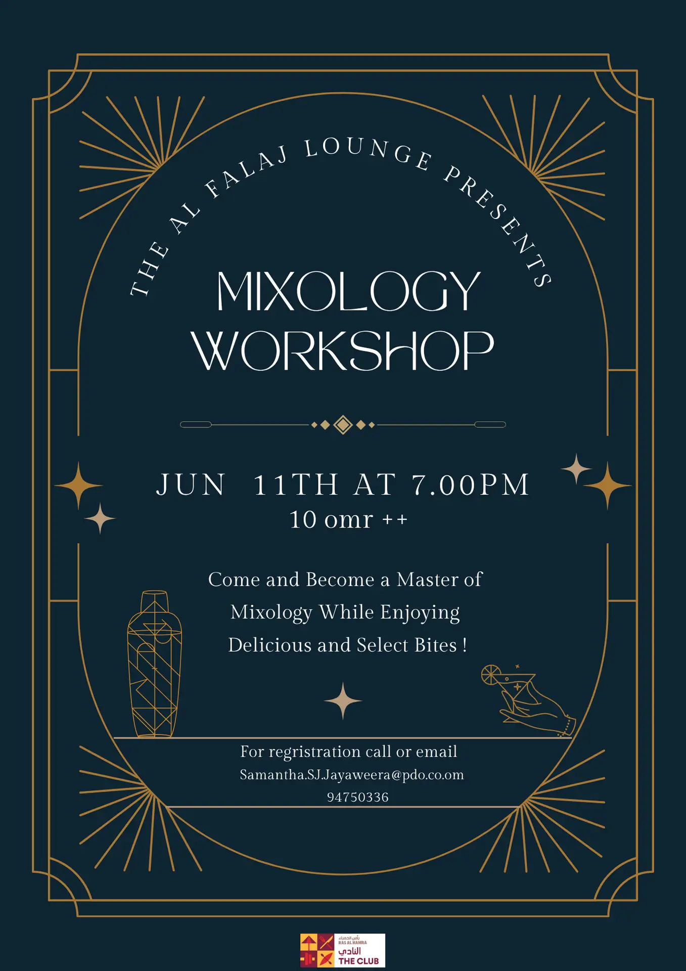
Mixology Workshop — Event Poster
I went for an after-dark, bar-room feel: a tall stacked wordmark builds drama, with tight lettering and a vertical read that pulls you straight to the date and start time. A lean grid anchors the price and RSVP strip at the base, while generous spacing keeps the composition sleek and easy to scan, proof that the right layout can pour the story
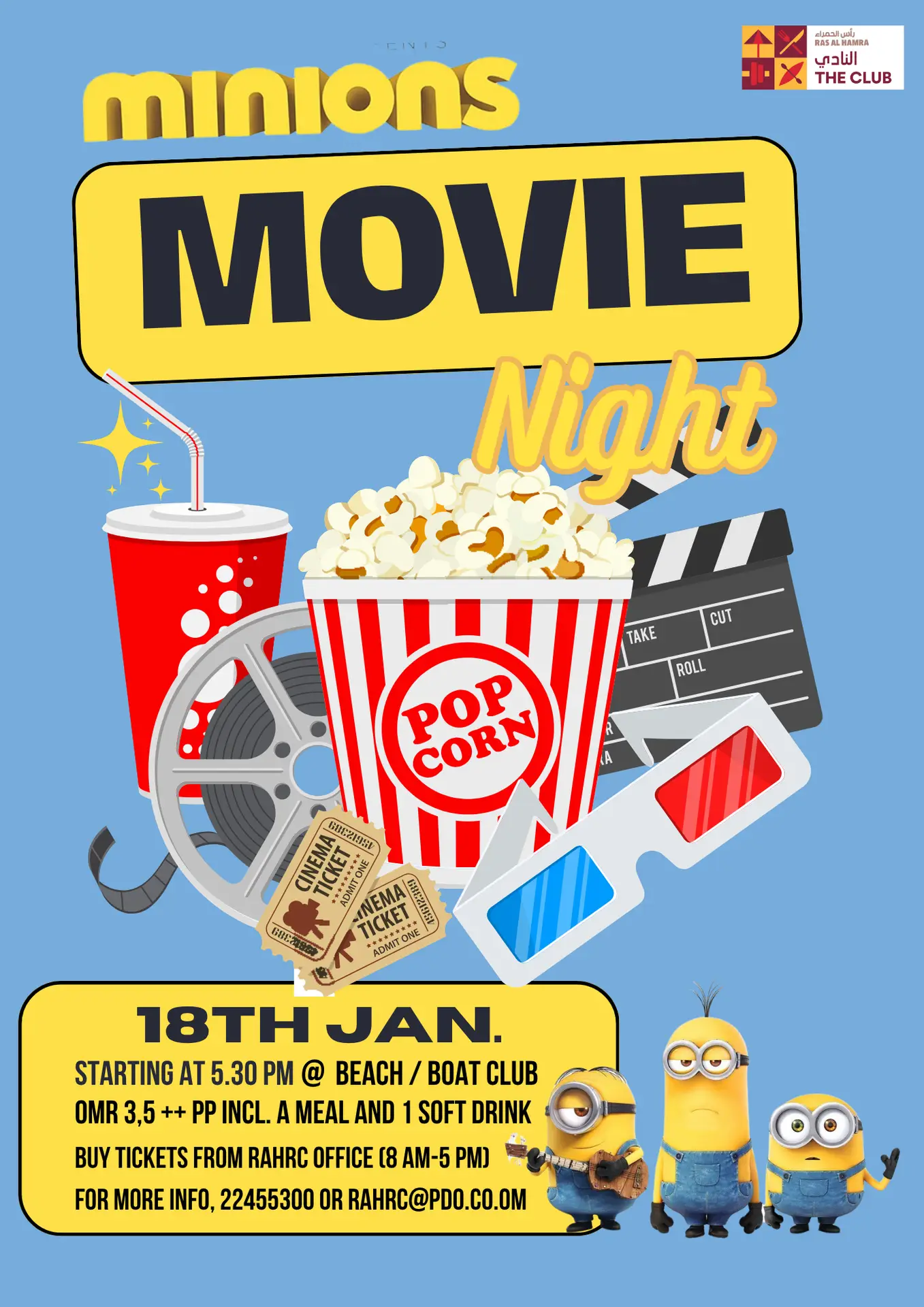
Movie Night Minions
A cinematic layout that reads in a heartbeat: the film title is the focal point, framed by character silhouettes and a palette lifted from the original for instant recognition. Strong typographic contrast and layered graphics build motion and depth, proof that design speaks louder than words.
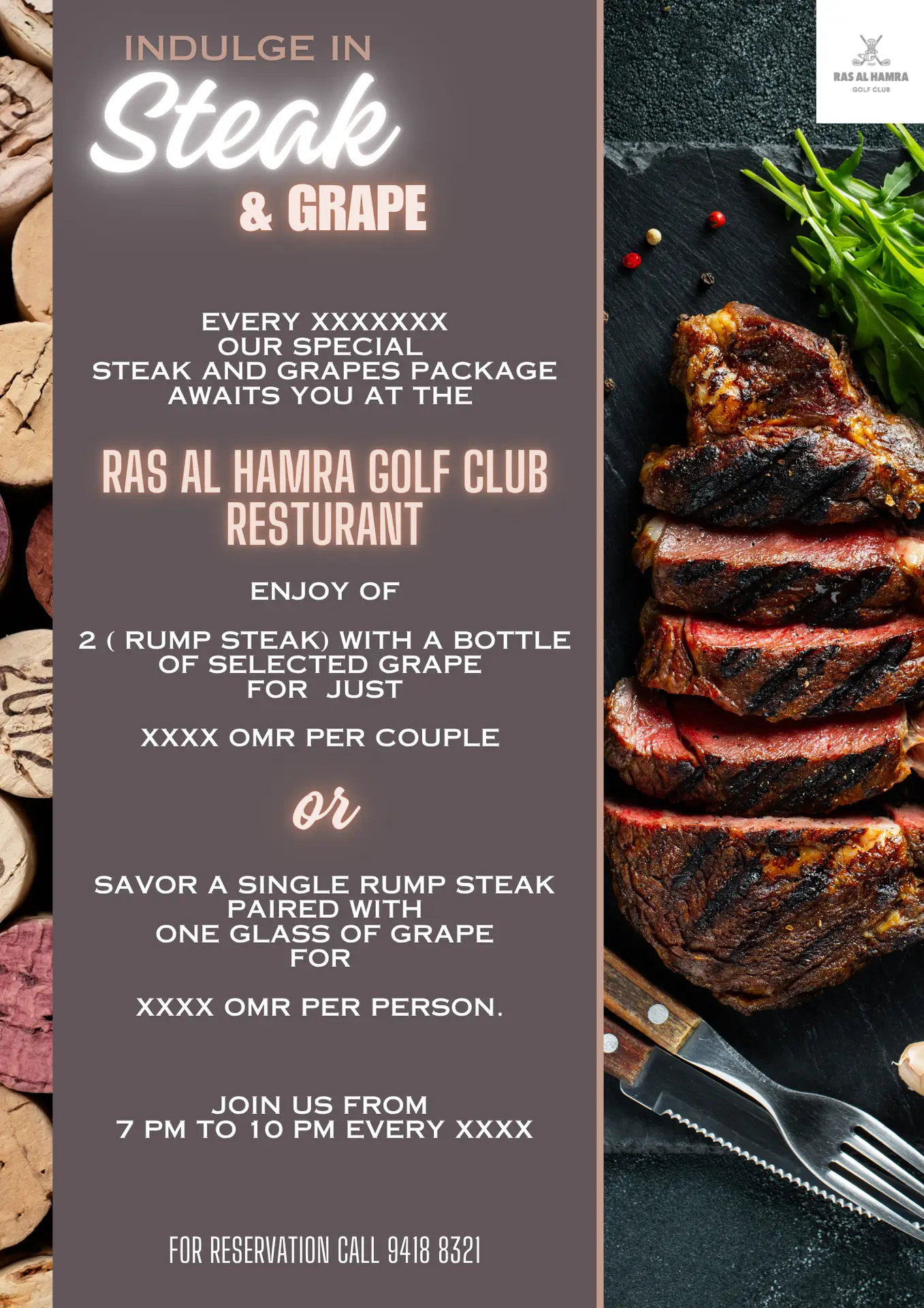
Steak & Grape – Event Poster & matching Voucher
Designed a stylish event poster and matching voucher to promote the weekly Steak & Grape night. The layout combines bold typography with mouth-watering food imagery to create a warm and inviting atmosphere, suitable for both print and digital use.
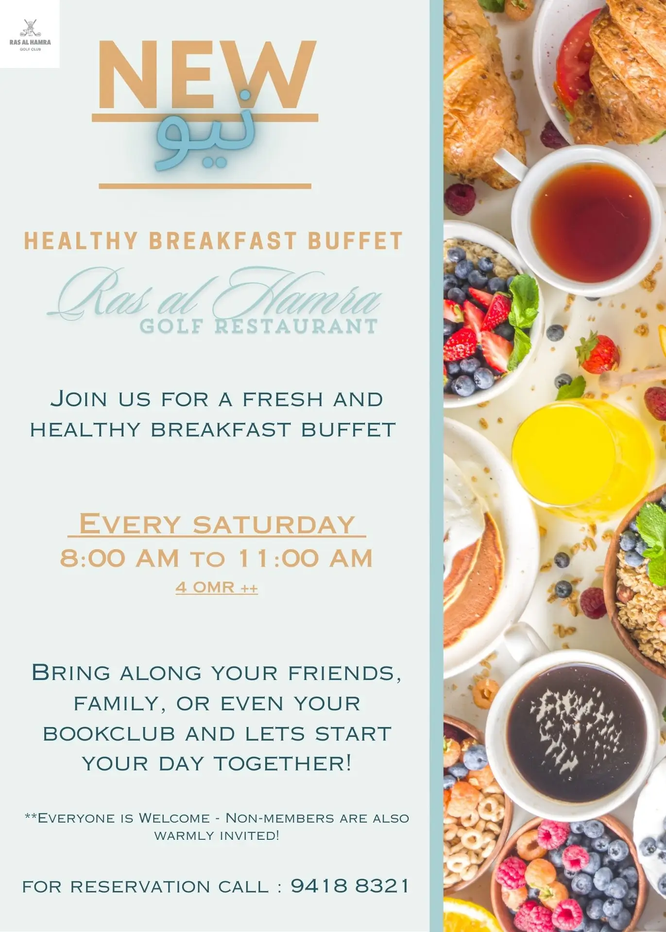
Healthy Menu — Breakfast, Lunch & Power Drinks
A light, health-forward layout with distinct dayparts and a clean pricing track for quick decisions. Airy spacing, balanced font pairing, and consistent alignment create a fresh, uncluttered read ready for both table printouts and digital viewing.
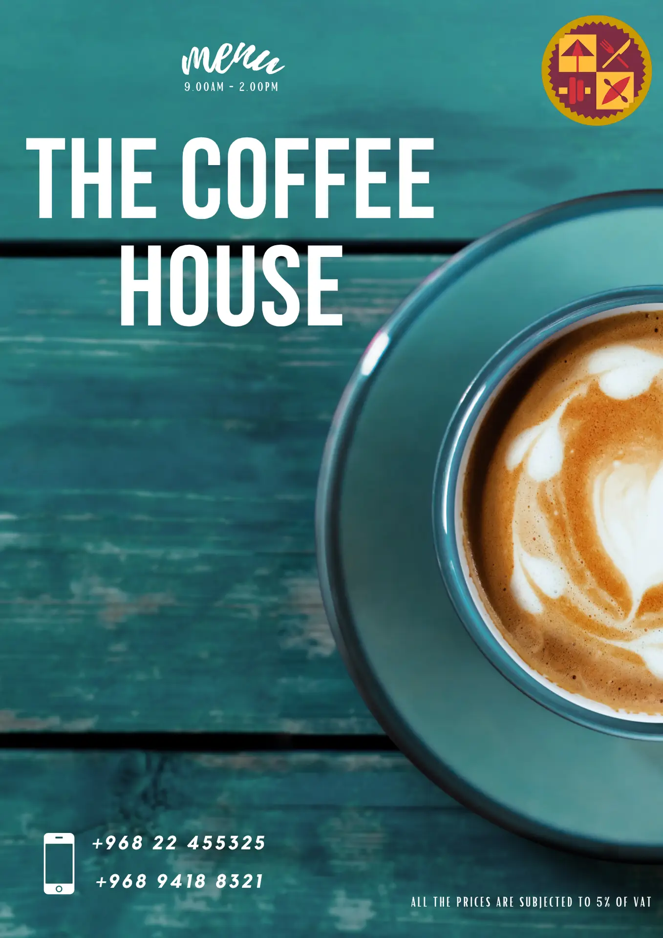
The Coffee House — Breakfast Menu
I structured the menu on a calm, modular grid: spacious section headers with refined letter-spacing, a locked price column for fast scanning, and consistent line rhythm so long dish names stay tidy. Micro-details: VAT note, service hours, and contacts are aligned to the same typographic system, keeping the page clear, elegant, and print-perfect while reading smoothly on screens too.
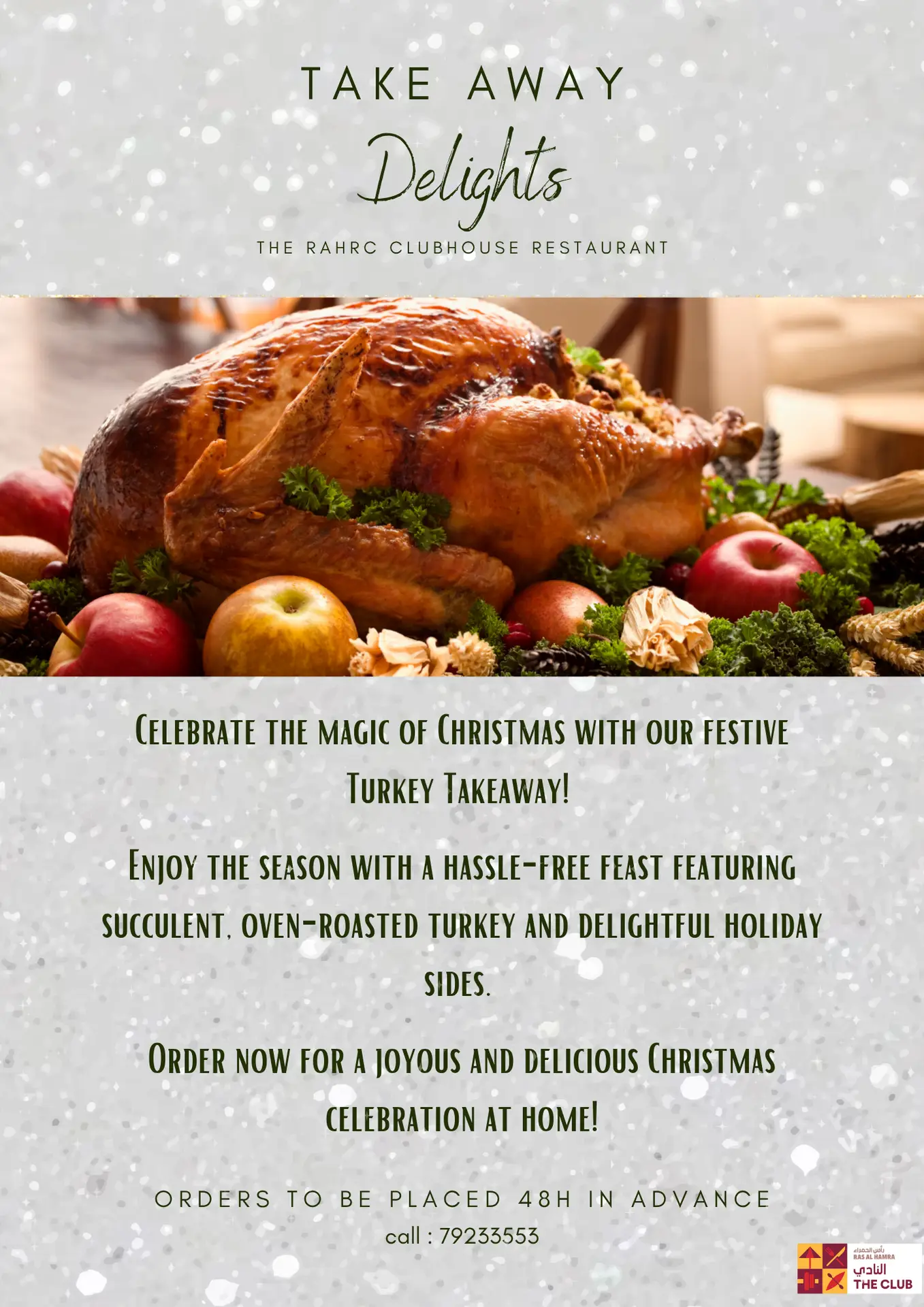
Festive Turkey Takeaway — Campaign Poster
I distilled a long holiday message into a one-look invitation: a seasonal red-green palette, roomy spacing, and a stacked headline lead the eye from promise to action. A clear reading path lands on the essentials 48-hour preorder and phone number, set in a high-contrast footer so ordering is effortless. Built to print crisply and repurpose across email and socials
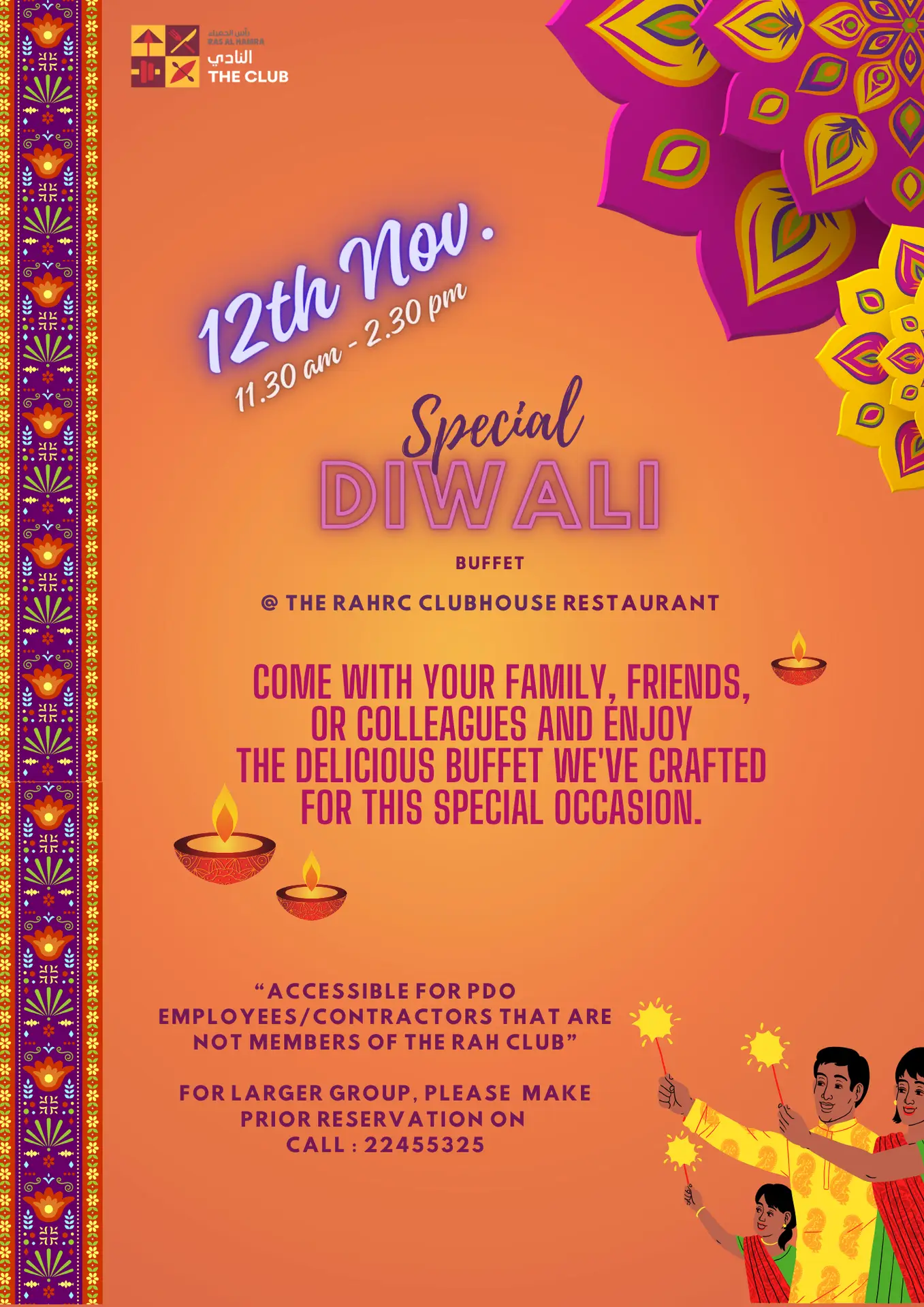
Special Buffet — Clubhouse Poster
A one-message invitation built to read in a blink: “SPECIAL” takes the stage, with a calm vertical rhythm leading into a bold “BUFFET” lockup and a clean access note for non-members. Wide breathing room, centered alignment, and a neat reservation line keep the offer effortless to grasp clear, welcoming, and print-perfect.
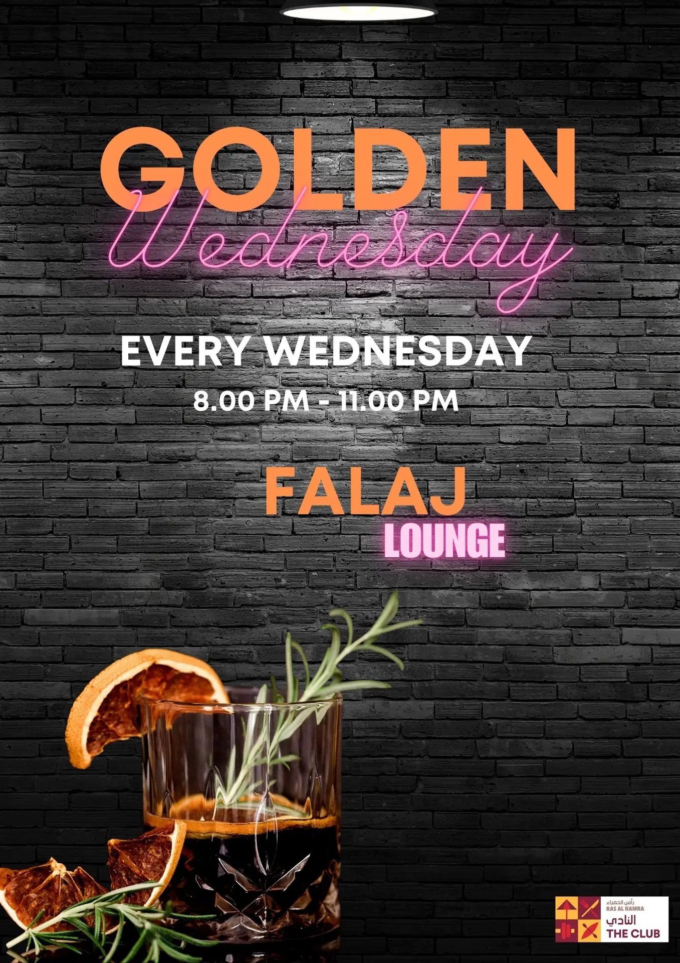
Golden Wednesday — Falaj Lounge (Event Poster)
The title swaps “Whiskey” for “Golden” a deliberate, inclusive cue that still evokes amber-toned indulgence and a premium mid-week treat. Neon script under bold caps reads like real signage; warm orange and magenta glow echo the hero cocktail. A clean center stack drops cadence → time → place at a glance, while brick texture and a soft spotlight lock in the lounge mood.
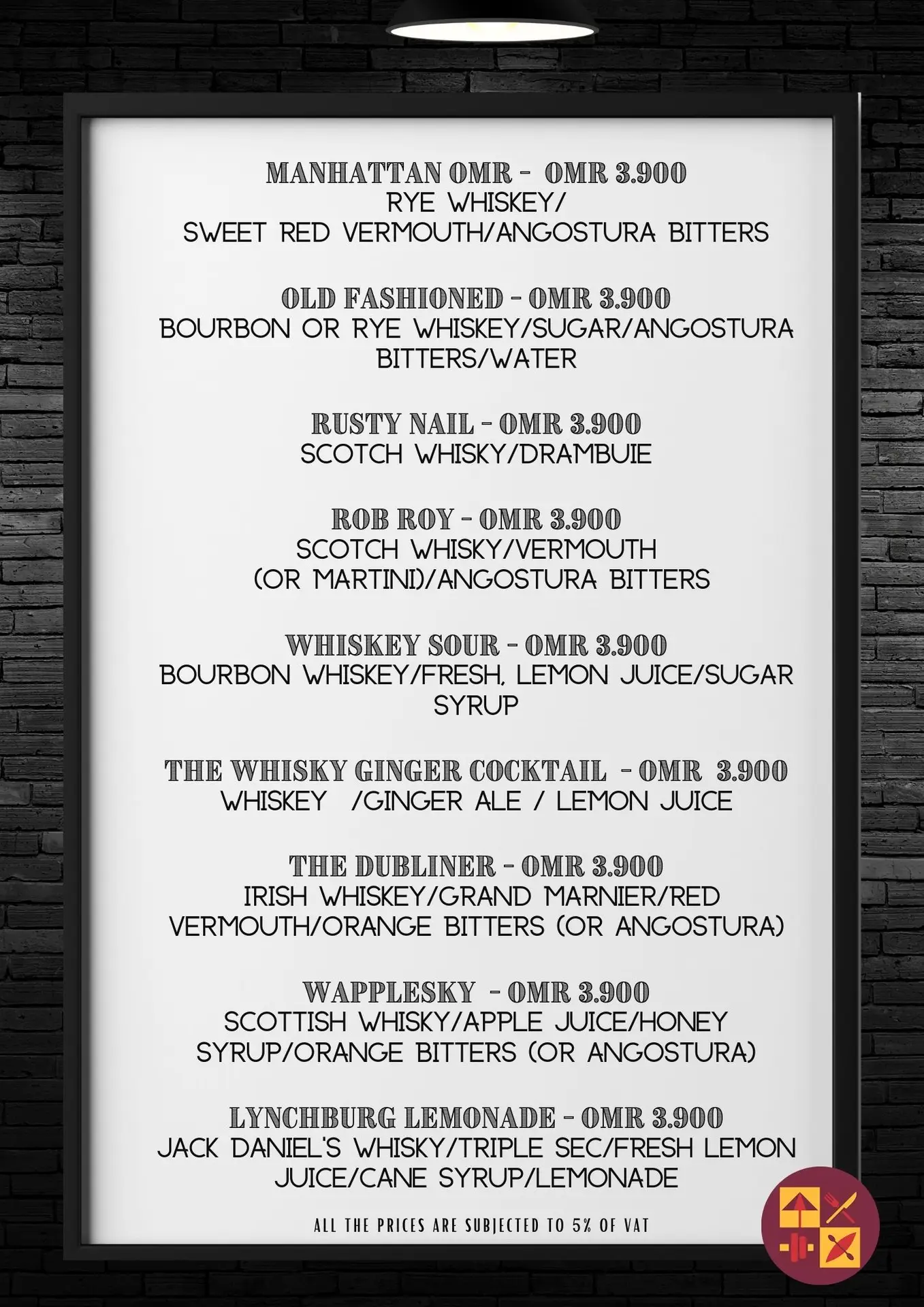
Golden Wednesday — Whiskey Classics Menu
A bar-side menu styled like a lit marquee: bright panel on brick, framed under a hanging lamp for a real lounge feel. Stamped headline lettering and tight line breaks give each cocktail its own stage, while a steady price rail keeps choices quick. Clean recipes sit under bold names, minimal ink, maximum clarity so the list reads fast and looks premium alongside the event poster.
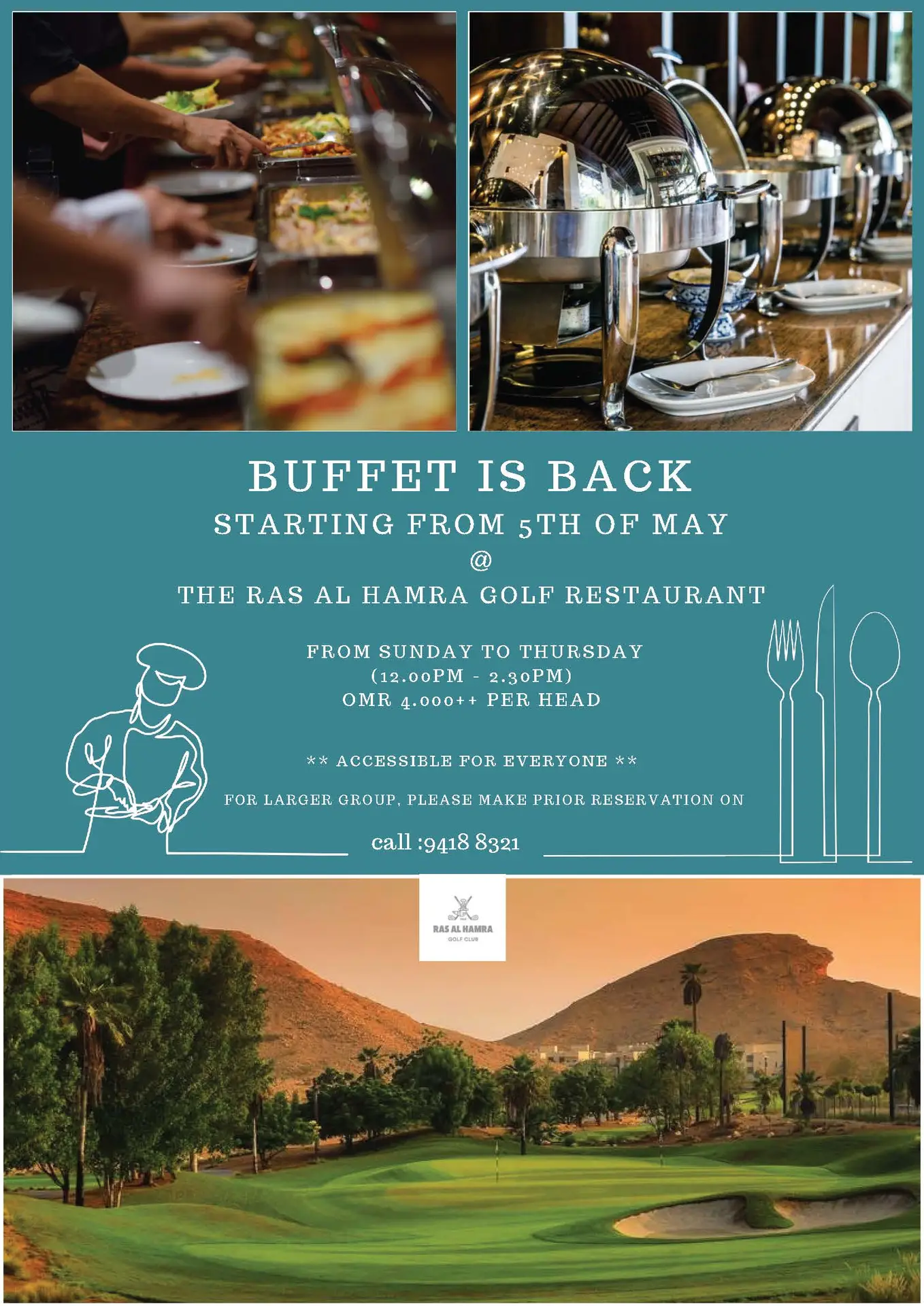
Buffet Is Back — Ras al Hamra Golf Restaurant
A comeback announced with confident lettering and a clean center stack: the wide-spaced headline leads, followed by a simple rhythm of venue, days, hours, and price. The “accessible for everyone” line and a tidy reservation cue sit on their own lines for instant scan clear, welcoming, and built to print crisply.
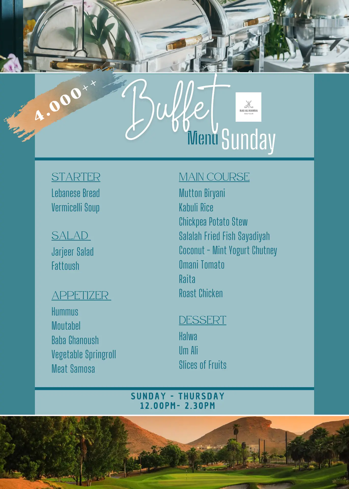
Golf Restaurant — Lunch Buffet Series
A weekday menu set designed like a lit noticeboard: bold dish titles, tight recipe lines, and a steady price rail on a clean grid so each day reads in one glance. The pendant-light/brick backdrop adds venue mood, while consistent spacing and alignment keep the whole series crisp for print and screens.
Seafood Night — Colour Edition (Crab & Lobster Artwork)
Illustration leads the story: lively crab and lobster motifs, a fresh ocean palette, and playful dividers bring the theme to life before a word is read. A punchy headline stack and compact info panel keep the essentials immediate, while the layout balances festivity with restaurant-level clarity.
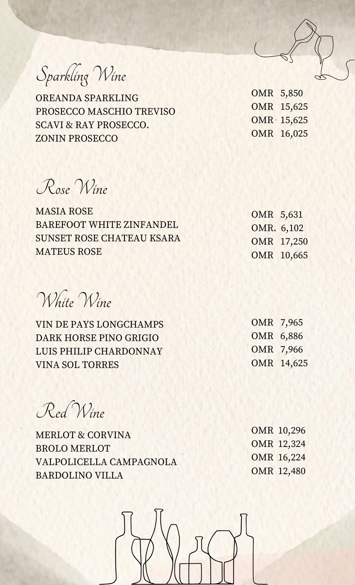
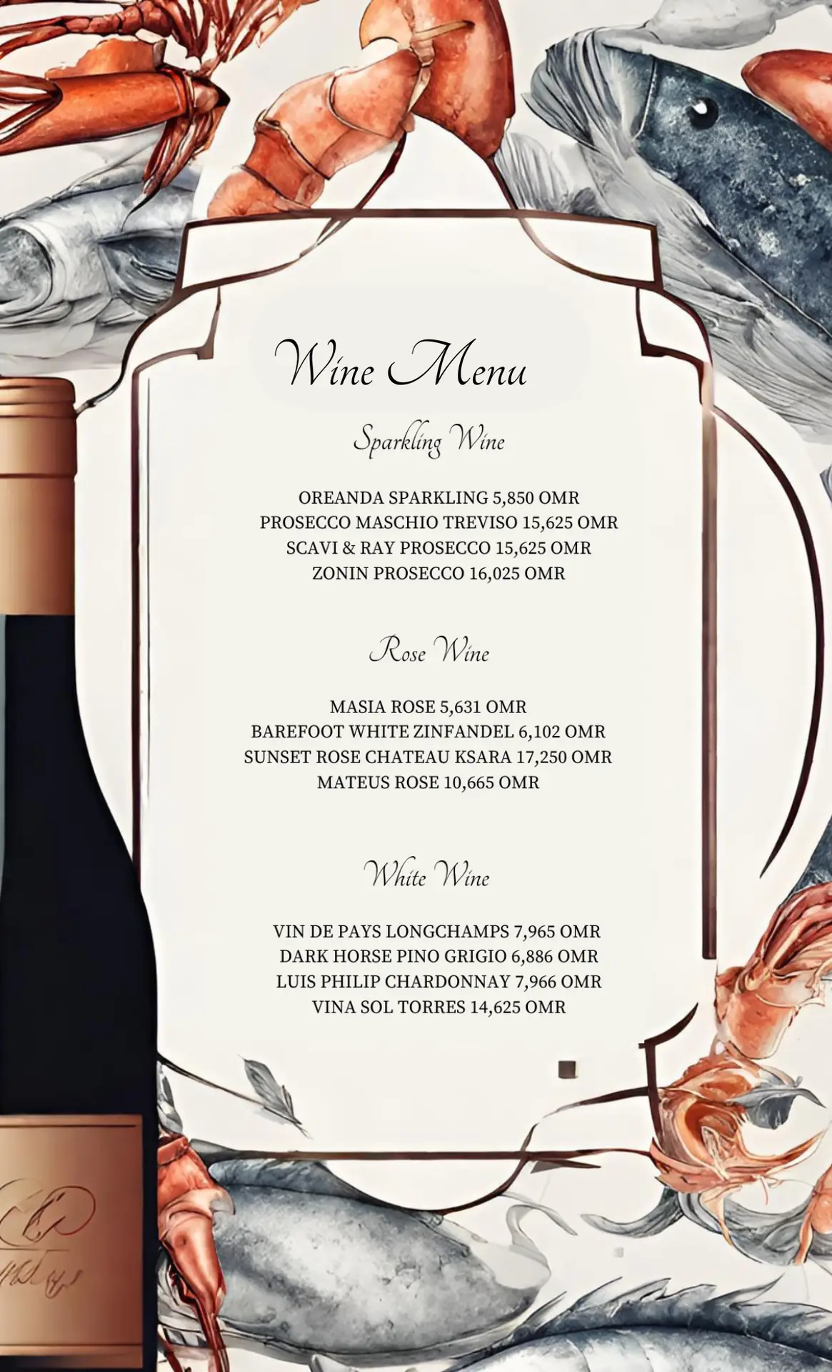
Wine List — Beige Edition (RAHRC Clubhouse)
A calm, linen-beige canvas with a tidy column grid and a steady price rail makes the list effortless to scan. Clear category blocks (Sparkling, Rosé, White, Red) and a refined header lock the page into a clean, service-ready system elegant in print, crisp on screens.
let's work together
From visual identity to digital design, I help you turn your ideas into powerful visuals that connect and inspire.
